03. Overview/Getting Started
Overview
This section provides an overview of Worldographer and explains important concepts. Worldographer makes four types of maps which are referred to as the following:
- World/Kingdom: Maps that span your entire world or a large portion of it such as a continent, country, or kingdom. A space/sector map can also be created in this mode.
- Settlement (aka City/Town/Village): Maps for a single settlement whether that is a large city, small village, or something in between. The map will have a number of top-down buildings.
- Battlemat: Maps for small areas such as a dungeon, wilderness encounter area, building interior, or even a spaceship. Generally, the maps are scaled so each square or hex is 5 feet (a little less than 2 meters).
- Cosmic/Star Maps: Show a hex map of a sector or sub-sector of space. Originally this was set up to be similar to Traveller maps, but it can be used for many game systems. Generated notes detail each system.
Using the Tools
Worldographer refers to objects/icons placed on the map as one of the following:
- Terrain/tiles: Ground terrain for large area maps such as worlds or kingdoms. Floor tiles for dungeons/battlemats. They can also be used for city/settlement maps, but often a shape with a texture is used instead.
- Features: Icons representing objects in the world. Examples: a city or fort icon on a world or kingdom map; a building or trees on a settlement map; doors, tables, chairs, etc., on a battlemat.
- Shapes: Lines, polygons, and ovals/arcs which represent roads or rivers or oceans on a world or kingdom map; the same things but larger on a settlement map; and a building’s walls and floor among other things on a battlemat.
- Labels: Text placed on a map. Note that features can have labels that are associated with those features and will move with the matching feature. These labels are edited on the Features tool area.
Details for Commonly Used Components
Color Picker
The color picker is used in many places in Worldographer and it has several pieces, so it is worth detailing in one spot. You’ll find it in the shapes drawer, in some of the configuration areas to configure terrain, etc.

The color picker shows a small patch of color and the name of the color (or a hex number such as #94b5c6 if the color has no name).
The medicine dropper is new in our 2025 version of Worldographer. Click it then click anywhere on your map and whatever color is displayed in that spot will become the color picker’s color.
To change the color to any color you’d like, click the currently selected color. A grid of color swatches appears, similar to the one below:
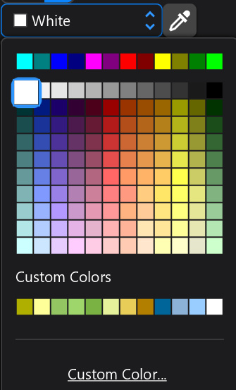
The swatches panel of the color picker has a row of primary colors at the top, followed by a grid of 120 common colors, then in most cases a list of Custom Colors (where the initial values match the background colors of the most common terrain types (farmland, light forest, hills, mountains, ocean, sea, etc.), and finally a link to open a custom color dialog. That custom color dialog looks something like this:
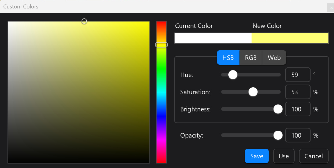
This dialog lets you pick just about any color you could imagine. The previously chosen color is shown as “current color” near the top center-right while the color you’re creating/picking shows as “New Color” next to it.
Pick a hue from the middle vertical rainbow, then select a shade using the large left box that goes from black to white in that hue. Or use the Hue, Saturation, and Brightness sliders to pick a color or use the matching number fields. Or switch to the RGB or Web color models using those buttons (center right) and use those controls to pick a color. The Opacity slider controls how solid the color is. A value of 0 makes a color that is invisible, a value of 100 makes a solid color, and a value of 50 makes a color that is half transparent.
Finally the Save, Use, and Cancel buttons control the output of this panel. Cancel will cancel these changes. Use will set the color to be used as the color for whatever this color picker matches such as the fill color for a polygon or the background color of a terrain tile. Save works as “Use” and will add the color to the “Custom Colors” section of the color picker’s grid of swatches as shown above.