07d. Terrain & Feature Toolbox Controls
Overview
The Terrain toolbox allows you to add terrain to a map. This is most useful for World/Kingdom maps. Battlemats can have Terrain added as floor tiles, but creating rooms, corridors, etc. as shapes allows for more flexible results which don’t have to match the grid.
The Features toolbox adds other icons to your map, depending on which map type you’re editing. For World/Kingdom maps, these can represent cities, castles, mines, forts, etc. For settlement maps, typically all the buildings are features as well as trees and many other map objects. Features are used for doors, tables, beds, and many more items–even tokens on battlemats.
Cosmic (sub/sector) maps generally just use a black “Stars” terrain as a background and then add features for star systems.
Floating Dialogs vs. Tabs
Note: You can have floating dialogs instead of tabs using the buttons in the top right of the menu bar. The functionality within the floating dialogs is the same as the tabs. In either case, we’ll refer to them as toolboxes. Pre-2025 Worldographer uses Drawers instead of Tabs, but it does also have Floating Dialogs.
Terrain Drawer
Because of the many terrain types built into the program (and you can add more of your own) for ease of use, filter your terrain buttons. To do so, use either the text field at the top of the drawer or the adjacent drop down list to filter by type. Here is a screen-shot of Terrain drawer filter by “mountain” and “Classic”:
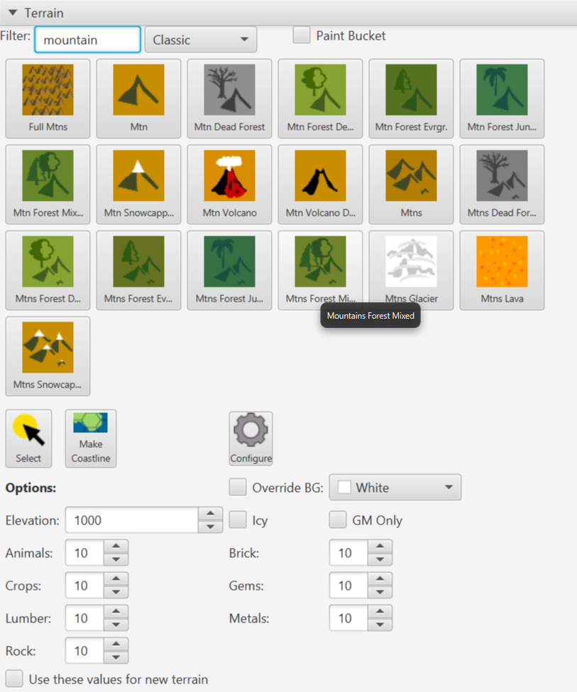
Here are descriptions of each control, going across then down:
Filter Text field and drop-down
These reduce the number of terrain buttons displayed, allowing you to find things faster. You can use either or both. The text field allows you to search for anything. The drop-down narrows the buttons based on type such as “Classic”, “Floor”, “Cosmic”, “Isom. Cols.” (Isometric Columns), “Isom. Rows” (Isometric Rows), and more.
Favorites
One special value in the drop-down list is “Favorites”. If selected, any Terrain you’ve added to your favorites list will appear here. To add terrain to your favorites, (once you’re no longer filtering by favorites) right-click on it and pick “Add to Favorites” from the pop-up menu. To remove one from your favorites right-click on it and pick “Remove from Favorites”.
Paint Bucket
Checking this box will perform a “flood fill” when adding terrain to the map. Instead of just the terrain you pick changing the the chosen terrain (the terrain button you clicked), any adjacent terrain of the same type will also be changed until a different type is encountered.
Terrain Buttons
These buttons occupy the majority of the terrain drawer. To place terrain on the map, click one then click on the map where you want it. You can also drag across tiles to more quickly place terrain. To place a cluster of seven hexes at once (the tile you click and each adjacent one) go to the Options menu and select “Wide Area Terrain Placement”.
Note: if you hover over any button, the terrain’s full name will appear as a tool tip.
Select Button
To select a specific piece of terrain on the map (perhaps to see & edit its values below) click this button, then click that terrain on the map. The selected terrain will have a yellow highlight around it. [Bug: it currently 2020 Sept 07 is too hard to notice. If the values below for animals, brick, etc., change then it was likely selected.]
Make Coastline Button
Select this button to have Worldographer generate a mini-coastline for each tile on the map you click while Make Coastline is selected.
Configure Button (Gear Icon)
Opens a dialog to edit the terrain settings: change the icons, background colors, add more terrain, etc. See the Configure menu’s Configure Terrain section on the Menu Options Explained page for details.
Override Background Checkbox & Color Picker
If this checkbox is selected, then the color picker’s chosen color is used as the background of the terrain instead of its default background. This can work on currently selected terrain or the terrain placed next.
Icy Checkbox
Works like the Override Background Checkbox, but the color is set to white for land terrain and very light blue for water terrain.
GM Only Checkbox
Marks the currently selected terrain or the terrain placed next as “GM Only” if checked. Note: you can also mark terrain as GM only by right-clicking that tile on the map and selecting an option in the pop-up menu. Make sure you don’t have “Show GM Only Items” selected on the View Options drawer–otherwise the GM Only objects are shown anyway. (That checkbox is designed to be an easy way for the GM to see the map for a moment, then un-check it to show the map to the players.)
Elevation Field
The average height (in feet) of the selected terrain. The system only uses this value when placing rivers one World/Kingdom maps via the Generate menu’s “Generate Rivers” item. It roughly ensures all rivers it adds flow downhill, although it does allow for a small variance (10%) because the river may flow from a high spot of an overall lower terrain tile to a tile with a slightly higher average elevation.
Animals, Brick, Crops, Gems, Lumber, Metals, Rock Field
Numbers that represent how plentiful the given resource is in the selected terrain tile. Generally by default these are relative values from 0 to 100. The system has default rough values for each terrain type which value slightly each time the terrain is placed on the map. There currently is no way to edit these defaults. They are currently only used for city/town/resource placement when using the Generate menu’s “Generate Nations/Empires” option for a world/kingdom map.
Use these values for new terrain Checkbox
If selected, any new terrain you add will have the currently set elevation, animals, brick, etc., values. You should only check this box if you have very specific numbers in mind for these values as you place the next terrain on the map. (The system’s defaults are likely good enough in most cases, especially considering the time to change each of these values between placing each terrain on the map.)
Features Drawer
The Features drawer has a lot in common with the Terrain drawer, with many additional controls. As with the Terrain drawer above, we highly recommend you use the filter text field and drop-down to narrow down your Feature buttons. Below is a screen shot of the Features drawer filtered by “Classic” in the drop down, but unfiltered otherwise:
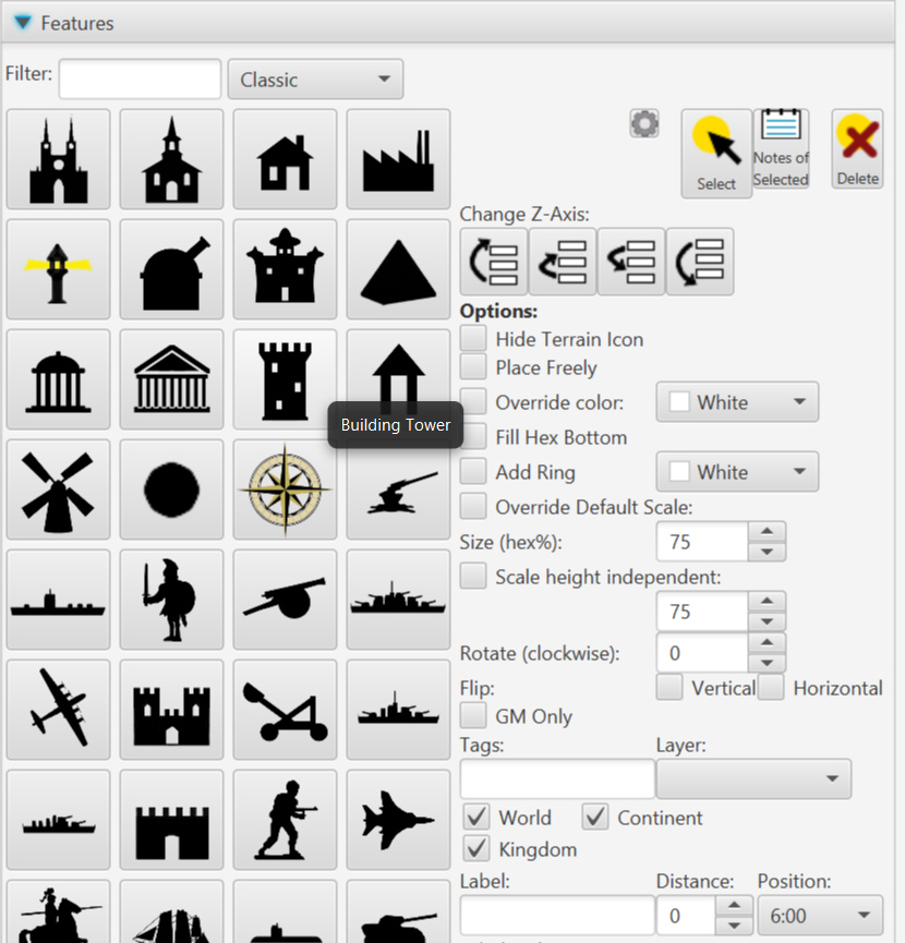
Here are descriptions of each control, going across then down:
Filter Text field and drop-down
These reduce the number of feature buttons displayed, allowing you to find things faster. You can use either or both. The text field allows you to search for anything. The drop-down narrows the buttons based on type such as “Classic”, “Floor”, “Cosmic”, “Isometric”, and more.
Favorites
One special value in the drop-down list is “Favorites”. If selected, any Feature you’ve added to your favorites list will appear here. To add featurers to your favorites, (once you’re no longer filtering by favorites) right-click on it and pick “Add to Favorites” from the pop-up menu. To remove one from your favorites right-click on it and pick “Remove from Favorites”.
Feature Buttons
These buttons occupy the most of the left half of the Features drawer. To place a feature on the map, click one then click on the map where you want it.
Note: if you hover over any button, the feature’s full name will appear as a tool tip. (As with “Building Tower” above.
Configure Button (Gear Icon)
Opens a dialog to edit the feature settings: change the icons, add more features, etc. See the Configure menu’s Configure Features section on the Menu Options Explained page for details.
Select Button
To select a specific feature on the map (perhaps to see & edit its values) click this button, then click that feature on the map. (If multiple features overlap, the top one will be selected.) A yellow circle highlight appears over the feature when it is selectable. The highlight darkens when selected. (Red dot(s) will also appear on the edges of the circle: one to rotate the selected feature, and four more to resize it if “Override Default Scale” is selected–see below.)
Note: You can select multiple features on the map by holding down the control key as you click each additional feature. The values in the Features drawer (GM Only, Override Color, Fill Hex Bottom, etc., will only represent the values of the first selected features. However, changes to any of the setting controls will change that setting for all selected features. This is an easy/quick way to toggle a setting for several features at once.
Notes of Selected
Every feature on the map can have notes associated with it. (Notes can also be added to the map without a feature using the “Add/Edit View Note” button on the View Options drawer.) If you have a feature selected, click this button and the feature’s notes will display as a dialog. Some features (most buildings for a settlement map) have notes auto-generated by the system when placed on the map. Some other features (the most common classic world/kingdom map icons such as city, town, village, castle, ruins, pyramid, etc.) have a note generated the first time you use this button for the selected map feature. In any case, the note can be expanded upon, ignored, or completely rewritten.
See the View Options drawer’s Notes section for more about notes.
Delete
Deletes the currently selected feature(s) from the map. If any have notes associated with the feature, those are deleted as well.
Change Z-Axis Buttons
These four buttons will move the selected feature(s) up or down (aka above or below) any other features they overlap, depending on the chosen button. The left most button moves the selected feature(s) to the top of all features. The middle left button moves the feature above one other feature it overlaps. (So if two features are above it and overlap, if moves above the lower of those two.) The middle right button moves the feature below one other feature it overlaps. And the right most button moves the selected feature(s) to the bottom.
Note: These Z-Axis buttons only affect the Z-Axis of features on the same layer. If a feature is on another layer, that other feature will stay above or below the selected feature despite using these buttons. The feature must either be moved to a different layer or the layers must be reordered. See the Layers section of the Mini-map, View Options, & Layers page for details.
Hide Terrain Icon Checkbox
This causes the terrain under the feature to not have the terrain’s icon displayed (only its background color will display. Turning this on is useful if the terrain icon will make the feature’s icon difficult to see.
Place Freely Checkbox
By default, Features are locked to the center of a terrain tile/grid. This was done to emulate the style of classic world maps. However, for many other map styles you want to place a feature at a specific spot (adjacent to a river for a world/kingdom or settlement map, up against a wall for a battlemat, etc.). To do so, select this box.
Override Color Checkbox & Color Picker
If selected, the feature icon you selected will be recolored to match the color you choose via the color picker when you place it on the map.
Fill Hex Bottom
If checked and if the feature is not “placed freely” (see above), the bottom 30% of the tile you place the feature it will be filled with black or with the “Override Color” if that checkbox was selected. (Capitals will have the hex bottom filled with red to match those classic icons.
Add Ring Checkbox & Color Picker
Adds a ring of the chosen color around an icon when placed on the map. This is used to replicate some science fiction/space maps where rings around icons signified various attributes about that star system.
Override Default Scale Checkbox and Size(%) Field
If you want the feature to have a different size than the default, check this box and use the Size field to enter a percentage of a tile’s width. A negative value in the field will also cause the default size to be used. The height is proportional unless the “Scale Height Independent” checkbox is checked.
Scale Height Independent Checkbox and Number Field
If you want the feature’s height to vary (not stay proportional) to a custom width (see the options immediately above), then check this box and enter a percentage of a tile’s height. A negative value in the field will also cause the default size to be used.
Rotate (Clockwise) Field
Number field to rotate the feature by a number of degrees in a clockwise direction. A feature may also be rotated by rotating a red circle that appears next to it on the map when selected.
Flip Vertical & Horizontal Fields
Check either of these boxes to flip the selected feature (or the next feature you place) horizontally or vertically.
GM Only Checkbox
Marks the currently selected feature or the feature placed next as “GM Only” if checked. Make sure you don’t have “Show GM Only Items” selected on the View Options drawer–otherwise the GM Only objects are shown anyway. (That checkbox is designed to be an easy way for the GM to see the map for a moment, then un-check it to show the map to the players.)
Tags Field
Add descriptive tags to the selected feature or the feature placed next. These can be used to turn groups of map objects on or off via the show & hide tags options on the View Options drawer. See that page for more details.
Layer Drop-Down List
This control allows you to change which map layer the selected feature belongs (or the next feature you place on the map).
World/Continent/Kingdom Checkboxes
For World/Kingdom maps, these checkboxes control if the selected feature appears on the map corresponding map view level. Note: you can not un-check the checkbox that matches the current view level. These checkboxes have no effect on settlement maps or battlemats.
Label, Distance, & Position Controls
You can add a label that is associated with the selected feature (or the next feature placed) with these controls. Enter the text of the label in the label field. Distance represents the percentage of a tile from the center of the feature. Position represents a clock position for the center of the map label.
Label Style & Label Font Controls
Select a style for the label with this selector. If you choose “No Preset Style” use the controls below in the dark grey area to set the font, color, size, etc.
Feature Decorations
You can add a number of additional symbols or bits of text around the feature with these controls. This section starts with a field of symbols used in some popular science fiction games which used these symbols to denote properties of star systems on cosmic maps.
Each row after that has a checkbox, small text field, drop-down list for clock positions, and a color picker. Each row corresponds to one possible feature decoration. Check the box if you wish to use that row for a feature decoration. Then enter the text or symbol in the text field (it is best to use one character). Next, pick the clock position for where that feature decoration should appear with respect to the selected feature (or next feature you place). Finally, use the color picker to choose the color for the text/symbol.