07e. Shapes & Labels Drawers
The Shapes and Labels drawers contain the third and fourth most common map objects next to terrain and features.
Shapes Drawer
The shapes drawer has a lot of controls, so let’s get right to it. Here is what it should look like:
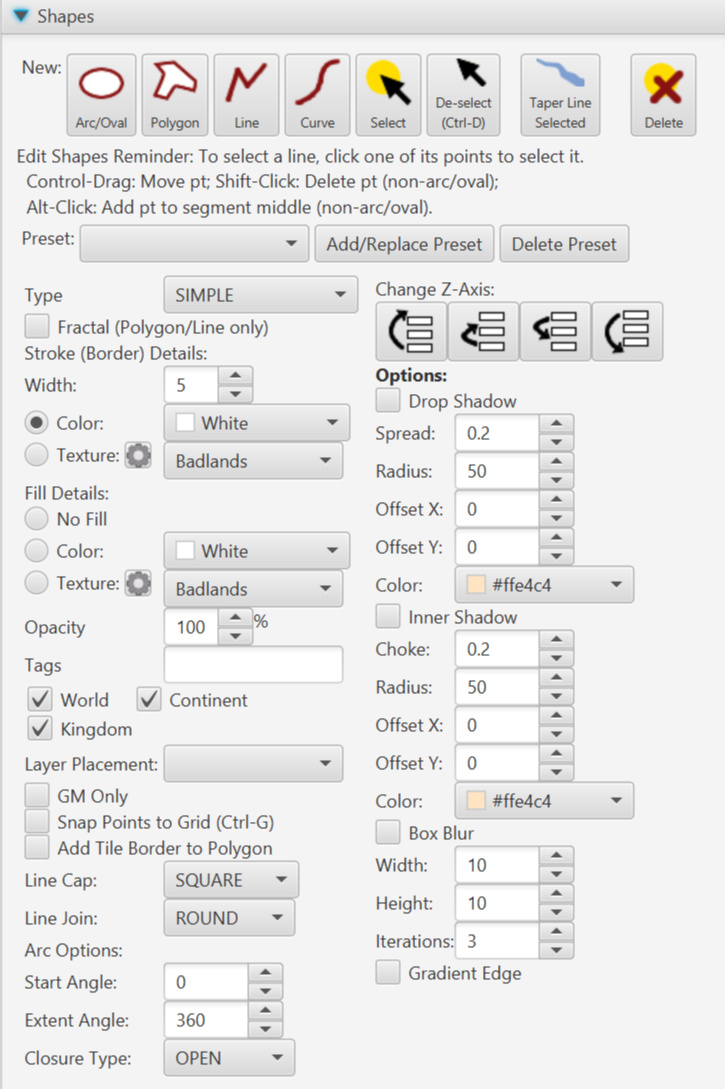
These are described in detail below. The list below goes across the top, then down the left column, and next the right column.
New Oval/Arc
Select this button to create a new oval or arc. Once selected, click on the map where you want one corner of an imaginary bounding box of the arc/oval to be located, then either click where the opposite corner should be or drag to the opposite corner.
New Polygon
Once this is selected, click points on the map to create a polygon. If you don’t see a border to the polygon and want one, make sure the stroke/border width isn’t 0. If you don’t see a fill and want one, make sure “No Fill” is not selected. If you see neither a fill or a border, check both of those and make sure Opacity is not 0.
New Line
Select this button, then click the points for a line. If you don’t see a line, make sure the stroke/border width isn’t 0. If “No Fill” isn’t selected, the area from the first point to the last will be filled with a color or texture. Select “No Fill” to remove the fill.
New Curve
Once selected, click points on the map to draw a curved line. Think of this in groups of three after the first point. That first point is considered an anchor point. Then the next two points are control points which control the bend of the curve to the 4th point which is the next anchor point. Then the 5th & 6th points are control points toward the 7th point. And so on.
Otherwise, keep in mind the same caveats/instructions as New Line above.
Select Button
To select a specific shape on the map (perhaps to see & edit its values) click this button, then click a point of that feature on the map. (All points of all shapes on the map appear as small grey dots when the Select button is pressed but no shape is selected. Most of the selected shape’s points turn blue once selected, but the first point becomes red and the last green.)
Note: You can select multiple shapes on the map by holding down the control key as you click where a point would be for another shape–you’ll have to guesstimate where other shape points are because the grey dots disappear once the first shape is chosen. The values in the Shapes drawer (Stroke settings, Fill Settings, Drop Shadow, GM Only, etc., will only represent the values of the first selected shape. However, changes to any of the setting controls will change that setting for all selected shapes. This is an easy/quick way to toggle a setting for several shapes at once.
De-Select Button (Control-D)
De-selects the currently selected shape(s). You can also hold down control and press D only your keyboard to de-select as long as no other control that handles keyboard events has focus. (Ex: if you were last typing in a text field, the Control-D is assumed to be needed by that text field.
Taper Line Selected Button
Usually used for rivers, this control makes a currently selected line into a shape with a point at one end and a larger opening at the other end. The first point on the line (with a red dot when selected) becomes the point, and the last point becomes an opening that is double the line’s width. Afterward, you can edit the shape as any other polygon.
Delete Button
Deletes the currently selected shape. You can also use the “Delete” key on your keyboard as long as another control doesn’t have focus. (For example: If you’ve clicked in a text field, delete will delete the character behind the cursor instead.)
Help Text
The Shapes drawer has a little bit of help text reminding you how to select shapes, move points, add points within a shape, etc.
Preset Drop-down List
Worldographer has a number of pre-set shape styles for roads, rivers, dugeon floor/wall, etc., for creating maps in certain fantasy styles. Select one of these and the controls below will change to match that style.
Add/Replace Preset
Click this button and a dialog appears where you can name the current shape settings and save them for re-use. If you use a name already in use, those settings are replaced with the currently chosen settings.
Delete Preset
Opens a dialog where you can select a preset to delete from the list.
Fractal (Polygon/Line only) Checkbox
If selected, when drawing lines and polygons, a number of extra points are added between each point you place to make the line look more random.
Stroke (Border) Details
These controls let you control the stroke of the shape–which is the key part of a line and the border of an arc/oval or polygon. Set a width using the number field next to “Width”. This is a percentage of the width of a tile. Set it to “0” if you don’t want a border/stroke for the selected shape or the next shape you place. Use the color picker next to Color to change the color if this radio button is selected. (See the Overview’s Color Picker section for details.) Or, if the Texture radio button is selected, pick a texture from that drop-down list. The Gear icon next to Texture allows you to configure the textures (add more, change the images, etc.).
Fill Details
The No Fill, Color, and Texture radio buttons let you toggle between these options. The color picker next to “Color” allows you to pick the color. (See the Overview’s Color Picker section for details.) The Gear icon next to Texture allows you to configure the textures (add more, change the images, etc.). (See the Configure Textures section of the Configuration Windows page for more information.) And the drop-down list next to it lets you pick a texture among the textures loaded into Worldographer.
Note: A line can have a fill that spans from the first point to the last, sort of like an open polygon. To get rid of the fill, select “No Fill”.
Opacity
Controls the overall opacity percentage of the shape. (A value of 0 will result in a shape that isn’t seen, 100 makes a solid object, and 50 will make the shape half see-through.) Note: The color choosers also allow you to control the opacity of the colors for the fill or stroke.
Tags Field
Add descriptive tags to the selected shape or the shape placed next. These can be used to turn groups of map objects on or off via the show & hide tags options on the View Options drawer. See that page for more details.
World/Continent/Kingdom Checkboxes
For World/Kingdom maps, these checkboxes control if the selected shape appears on the map corresponding map view level. Note: you can not un-check the checkbox that matches the current view level. These checkboxes have no effect on settlement maps or battlemats.
Layer Placement Drop-Down List
This control allows you to change which map layer the selected shape belongs (or the next shape you place on the map).
GM Only Checkbox
Marks the currently selected shape or the shape placed next as “GM Only” if checked. Make sure you don’t have “Show GM Only Items” selected on the View Options drawer–otherwise the GM Only objects are shown anyway. (That checkbox is designed to be an easy way for the GM to see the map for a moment, then un-check it to show the map to the players.)
Snap Points to Grid (Ctrl-G) Checkbox
If selected, as you draw a shape, each point is snapped to the grid as well as 1/4, 1/2, and 3/4 between grid lines. (Some map styles allowed points of shapes to cut part way into a tile. This doesn’t affect the previously placed points of a selected shape. If you wish to line those up, you’ll have to move them slightly. Once dragged slightly, the point will snap into position.
Add Tile Border to Polygon Checkbox
This checkbox allows you to add tiles to a polygon. It helps make polygons that match the borders of tiles. It is best to add one tile at a time (click in each tile, don’t drag across several) and to work in a contiguous path–don’t make a shape with an overall hole in the middle.
If you get a strange result where the shape’s borders get messed up, use undo and add the tiles in a different order. Or, delete the shape and try again with a different ordering.
Line Cap
This drop down has the following options for the ends of lines:
- Square: Boxes out the end of the line so a section equaling half the width of the line is added to the end.
- Butt: Boxes out the end of the line, but doesn’t add anything beyond the last point.
- Round: Adds a half circle to the end of the line. The circle’s diameter is equal to the width of the line.
Line Join
This drop down has the following options for connecting line segments of a shape:
- Miter: Sharp corners ending in points.
- Bevel: The corners have been cut off leaving two less sharp corners.
- Round: The corners where segments connect are rounded.
Start Angle, Extent Angle, & Closure Type
Use these fields for arcs & ovals only. Start Angle is the number of degrees to where the oval will start, with 0 as the 3:00 position, 45 as the 12:00 position and so on. The Extent Angle is how many degrees in the same direction to continue the oval. Finally, the closure types are as follows:
- Open: The oval closes the area from the end of the extent back to the start angle with a straight line connecting the two, but the outer edge/border of the shape does not span that gap area.
- Chord: The oval closes the area from the end of the extent back to the start angle with a straight line connecting the two, and the outer edge/border of the shape does connect across that gap area.
- Round: The section from the extent angle back to the start angle is cut out like a pie, and no line connects across that area.
Change Z-Axis
These four buttons will move the selected shape(s) up or down (aka above or below) any other shapes they overlap, depending on the chosen button. The left most button moves the selected shape(s) to the top of all features. The middle left button moves the selected shape(s) above one other feature it overlaps. (So if two shapes are above it and overlap, it moves above the lower of those two.) The middle right button moves the shape(s) below one other shape it overlaps. And the right most button moves the selected shape(s) to the bottom.
Note: These Z-Axis buttons only affect the Z-Axis of shapes on the same layer. If a shape is on another layer, that other shape will stay above or below the selected shape despite using these buttons. The shape must either be moved to a different layer or the layers must be reordered. See the Layers section of the Mini-map, View Options, & Layers page for details.
Drop Shadow Settings
If checked, adds a shadow to the outer edge of the shape based on the chosen parameters. Spread affects the suddenness of the shadow’s cutoff. Radius is the width of the shadow. Offset X&Y allows the shadow to shift slightly. Finally, the color can be set with the color picker.
Inner Shadow Settings
If checked, adds a shadow to the inside edge of the shape based on the chosen parameters. Choke affects the suddenness of the shadow’s cutoff. Radius is the width of the shadow. Offset X&Y allows the shadow to shift slightly. Finally, the color can be set with the color picker.
Box Blur Settings
If checked, blurs the shape subject to the parameters. Width and height represent how large the blur can be in each dimension. Iterations impacts how blurry the shape becomes.
Gradient Edge
Attempts to add a gradient edge to the shape, if checked.
Labels Drawer
The labels drawer allows you to add text to the map. Here is what it looks like:
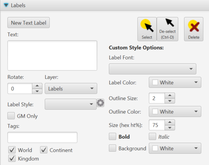
As with the Shapes Drawer explanation above, the following described each control first by listing the top row, then the left column and finally the right (“Custom Style Options”) column.
New Text Label Button
To place a new label on the map, enter the text in the field below, ensure the other settings match what you want, click this “New Text Label” button, then click on the map where you want the text centered.
Select Button
To select a specific label on the map (perhaps to see & edit its values) click this button, then click on that label on the map.
Note: You can select multiple labels on the map by holding down the control key as you click each additional label. The values in the Labels drawer (Rotate, Outline Size, GM Only, etc., will only represent the values of the first selected label. However, changes to any of the setting controls will change that setting for all selected labels. This is an easy/quick way to update a setting for several labels at once.
De-Select Button (Control-D)
De-selects the currently selected label(s). You can also hold down control and press D only your keyboard to de-select as long as no other control that handles keyboard events has focus. (Ex: if you were last typing in a text field, the Control-D is assumed to be needed by that text field.
Delete Button
Deletes the currently selected label. You can also use the “Delete” key on your keyboard as long as another control doesn’t have focus. (For example: If you’ve clicked in a text field, delete will delete the character behind the cursor instead.)
Text Field
Type the text you wish to appear as the map label here. You may use multiple lines.
Rotate Number Field
Number field to rotate the label by a number of degrees in a clockwise direction. A label may also be rotated by rotating a red circle that appears next to it on the map when selected.
Layer Drop-Down List
Each label is assigned to a map layer. You can move it to a different layer with this control.
Label Style Drop-Down List
Labels can have pre-set styles. These styles define the size, font, bold/italic, outline size & color, etc. Using styles makes it easy to change the look of all the labels of a given type at once. Use this control to set the Label’s style. Select “No Preset Style” if you want the label to use a custom style (see below).
Label Style Gear Button
This button opens a dialog to configure the pre-set label styles. See the Configure Labels section of the Configuration Windows page for more information.
GM Only Checkbox
Marks the currently selected label or the label placed next as “GM Only” if checked. Make sure you don’t have “Show GM Only Items” selected on the View Options drawer–otherwise the GM Only objects are shown anyway. (That checkbox is designed to be an easy way for the GM to see the map for a moment, then un-check it to show the map to the players.)
Tags Field
Add descriptive tags to the selected label or the label placed next. These can be used to turn groups of map objects on or off via the show & hide tags options on the View Options drawer. See that page for more details.
World/Continent/Kingdom Checkboxes
For World/Kingdom maps, these checkboxes control if the selected label appears on the map corresponding map view level. Note: you can not un-check the checkbox that matches the current view level. These checkboxes have no effect on settlement maps or battlemats.
Custom Style Options
Label Font
Label Color
Outline Size
Outline Color
Size (ht%) Field
Bold & Italic Checkboxes
Background Checkbox